Persona
“ I think education should be accessible to everyone, regardless of their circumstances.”
Goals
- Needs to graduate college to achieve career goals
- Wants to prepare herself for paying off student loans when she graduates
- Needs to find easily accessible educational data & regulations to use as resources for the workforce
Pain Points
- Filling out FAFSA Every year
- Looking for grants & scholarships
- Hates taking out loans
- Has a hard time finding information on 1098 and other tax forms
- Finds the ed.gov website to be difficult to navigate
Behaviors
Zoey is 23 and is an Education student at BU in Boston, Massachusetts. She lives with her parents and has a French Bulldog named Milly. She works part-time as a server at an Italian restaurant. Zoey is studious and works hard to achieve her goal of becoming an English teacher. Zoey frequents the US Department of Education website and other affiliated websites in order to get information about her major, and also to stay informed as a college student.
User Statement + User Path


Zoey, a student at Boston University needs to navigate the options for college financing and have access to educational data in order to prepare herself for her future both financially and career-wise.
Webpages visited by Zoey to accomplish her goal:
Home
Grants
> Pell Grants
Student Loans
Data
Laws
Navigation Analysis
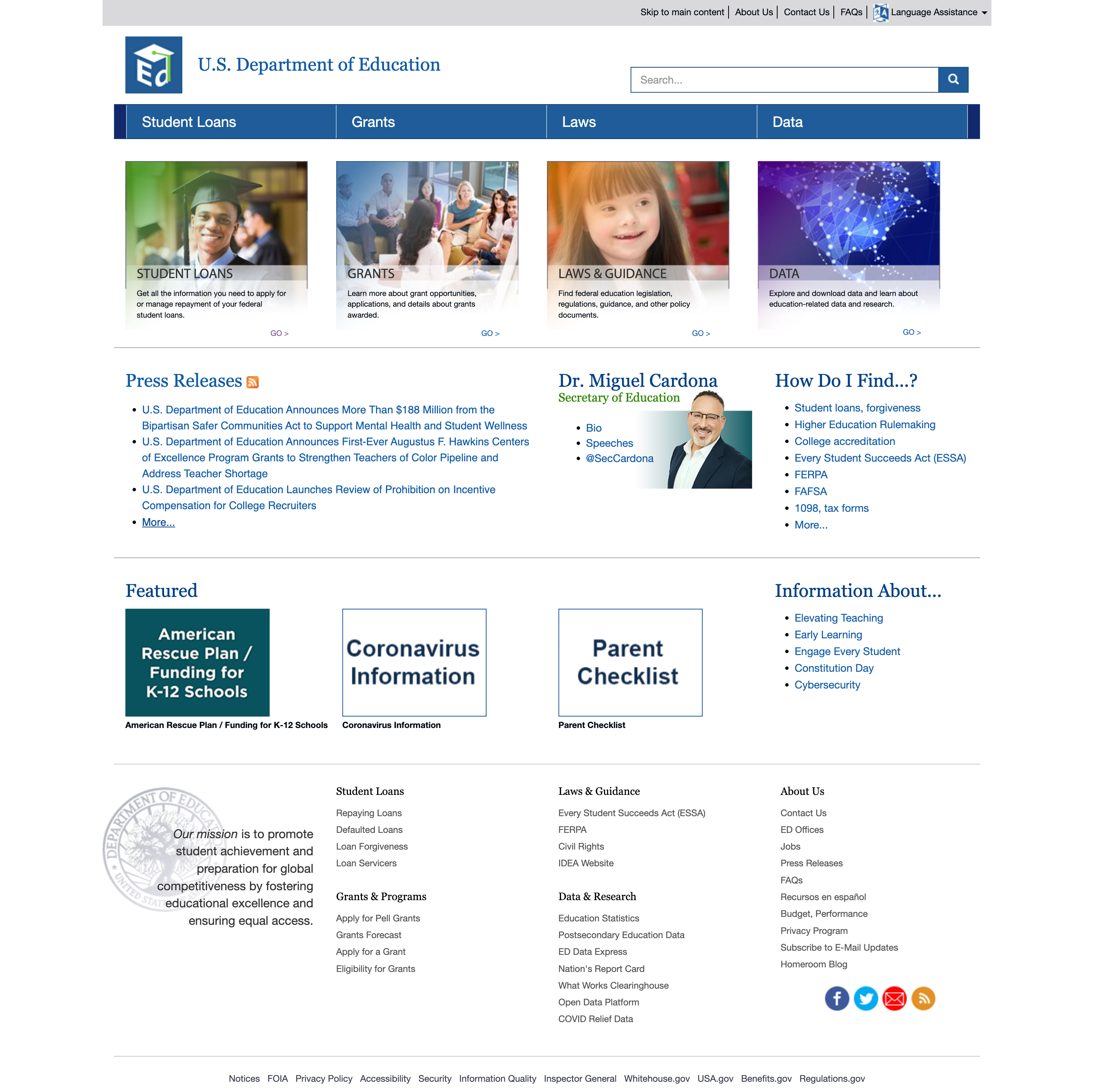
Top Nav Right Corner
- Skip to the main content (this button works on the navigation pages, but not on the Home page)
- About Us Contact Us
- Faqs
- Language assistance
- This navigation is hardly visible and I see some important info listed. I would like to give this nav hierarchy using color.
- Needs a home button
- FAQ, About Us, and Contact Us pages should be placed elsewhere as it’s not as visible as they should be
The U.S. Department of Education Logo Returns to the Homepage
- Search Bar – Highly visible where it’s at, I would like to see it with the top navigation bar though. If it doesn’t work I may leave it.
- The logo icon is a link but not the text. I would make the whole thing clickable.
Main Navigation
- Hover colors are grey and are too close to the same value as blue. I will use colors that have a
- Student Loans in Navigation goes to Student Loans, Forgiveness
- Also included is Login- Account Info (off-page link)
- Divided user paths: I’m looking for a loan. I already have a loan. These could be potential drop-downs in the navigation.
- Appears to be organized by hierarchy
- Does not have a drop-down menu, which makes navigation less straight-forward
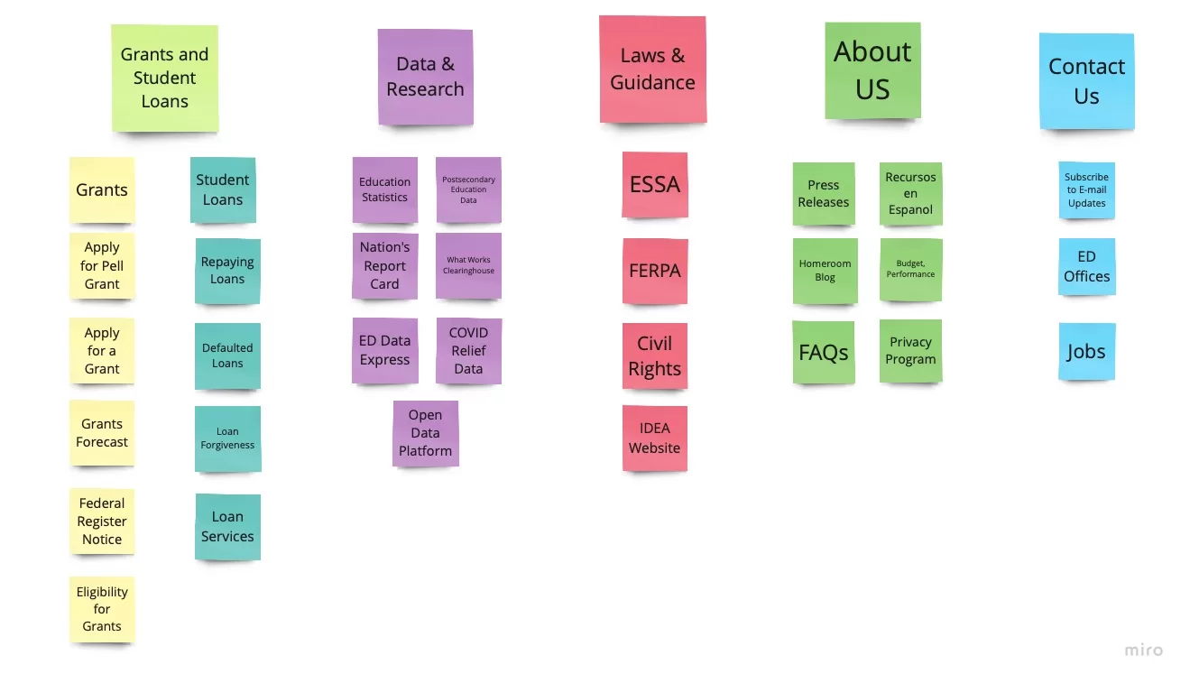
- Would merge navigation titles (such as student loans and grants) by relevance, and add an about and contact title
Grant Navigation Goes to the Grants Page
- Also included are Eligibility, Apply, Grants, and Scholarships( off-page link) which could be dropdowns.
- Divided User Paths on the page, Discretionary Grants, Pell Grants, and Other Student Aid
- Other Grant Info. At least half the likes go off the page. For better usability and easier search, I would include more written copy about what each link can do for you and an icon or symbol for links that take you off the page

Laws Navigation Goes to the Laws and Guidance Page
- Elementary and Secondary Education Act of 1965 (ESEA), as amended
- Lots of links, but half go off-site.
- FERPA (Family Educational Rights and Privacy Act)
- Civil Rights
- Idea (Individuals with Disabilities Education Act)
- WIOA (Workforce Innovation and Opportunities Act)
- Rehabilitation Act of 1973, as amended through P.L. 114–95
- Regulations and Rulemaking
- Higher Education Act
- Guidance
Data Navigation Goes to Data & Statistics
- K-12 Students/Schools
- Colleges/Universities
- Student Outcomes
- National Center for Education Statistics (NCES)
- Fast Facts
Footer
- No identifiable organization
- Appears to be linked to mostly external websites
- Would like to organize them alphabetically for easier visual identification
User Testing
The Plan
Create an interview script that will be used to create a consensus and align around research goals. Conduct interviews in person and using a google questionnaire posted on Facebook.
SEE: User Testing Plan > & Questionnaire > User Testing Video
Get input from a variety of demographics
- Talk to a variety of people
- Do at least 5-6 interviews
- Record them
- Conduct Surveys on Social Media
- Use the info to redesign the website
Use data to flesh out a redesign
- Craft a User Research Plan
- Synthesize research by conducting a heuristic evaluation
- Annotate useability
- Create a User Persona
Ask the right questions
- Introduce myself
- Ask about them
- Find out their relationship with education
- Ask them to navigate through the website
Always be improving
- Return to step 1 – follow through
- Use marketing automation tools to track the success

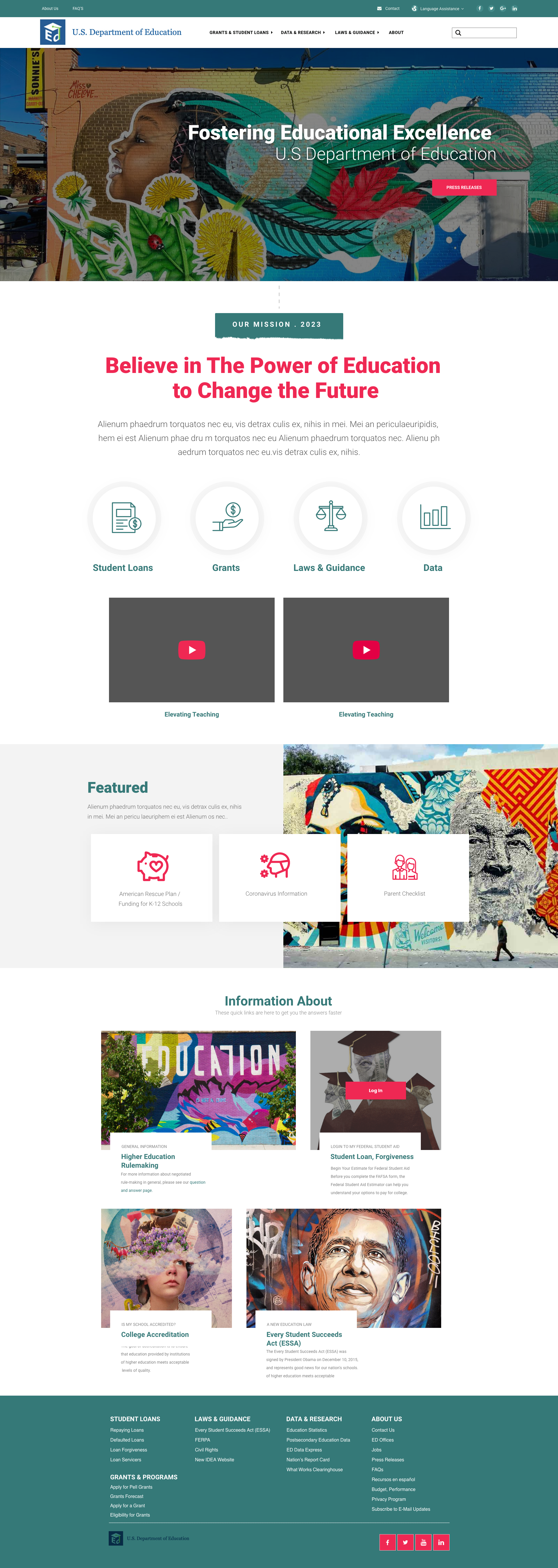
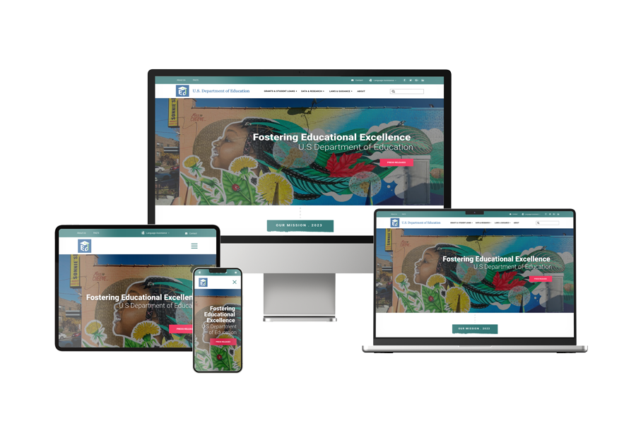
Prototype


Free Consultation
Book a free 30-minute Consultation with me for more information.

